
JUVENIL JUSTICE INFORMATION APP
OREGON JUVENILE JUSTICE INFORMATION SYSTEM
JUVENILE JUSTICE INFORMATION SYSTEM RE-DESIGN
Web App - State of Oregon
Background
The Oregon State Juvenile Justice Information System, used by both state and
36 county users for over 20 years, it no longer meets the needs of today's end
users due to outdated user interface, interaction, system maintenance, and
causing pain points in performing daily tasks. Consequently, the state has
contracted DMI to redesign the current application.
Design Responsibilities
As a UX/UI lead, I am responsible for overseeing the entire UX and UI approach,
which includes developing the strategy plan with agency stakeholders, obtaining
agency acceptance and approval, and conducting testing. Additionally, I lead
design workshops, establish high-level goals, manage agency and contractor
resources, and define the timeline. I also take the lead in creative design, ideation,
and presentation. Furthermore, I collaborate with other team leads, state and
county stakeholders, end users, and third-party contractors.
My Role
• Research
• UX|UI design lead
• Facilitate workshops, presentations, interviews, testing, etc.
End Users
Staff from the State of Oregon and 36 counties over 20 personas such as clerical staff, security coordinator, detention worker, custody staff, probation staff, records staff, medical, etc.)
Project Workflow
Although I followed the design thinking process, the information I had at the beginning, the client's situation, and the team and collaboration structure were different. I needed to have a different strategy to approach each step. A high-level introduction is presented in the sections below.
Step 1: Discoveried research
Step 2: Evaluated the current system and navigation benchmarking study
Step 3: Developed UX design strategy and testing plan
Step 4: Facilitated workshops
Step 5: Created information architecture
Step 6: Developed wireframes and prototypes
Step 7: Design, ideation and refinement
Step 8. Testing
Major
Contributions
Major
Achievement
Recognition
from Oregon State
Major Design
Challenges &
Concessions
Project Highlight Summary
Based on many years of UX/UI design experience, I felt comfortable leading this project. The challenging part is working with state stakeholders and both state and county end users. Unlike the general design process where designers work with stakeholders, interview, and test with end users, this time all major design decisions need to be decided by the state and county committee. For example, when I created look and feel options (the state application doesn't use the term "branding"), I presented my research and design to over 40 users from the state and counties. I introduced design principles, design patterns, and how to evaluate layouts. Then everyone voted for their favorite design option. During usability testing, end users' tech skills vary. Some didn't even understand what the drop-down arrow meant. Some users felt very stressed in the beginning. Usually, I needed to warm up for a few minutes before starting each test session to make them feel comfortable, demonstrate how to navigate the clickable prototype first, and keep interacting with them throughout the entire session. The JJIS involved various personas from many different roles, each with its focus area on the application. I participated in the epics and stories refinement meeting that SMEs and stakeholders facilitated to make sure that the new design fit end users' needs.


-
As a design lead, I invest a significant amount of effort in creating the UX strategy and facilitating workshops in the early stages. Because the end users come from both state and counties, all critical decisions need approval from both parties. Additionally, I must respect the voices of different teams. Since most of them lack a UX design background, except presenting the strategy, testing plan, and design options; I also need provide numerous examples from big brands or benchmark studies to explain the rationale behind my decisions.
-
UX research is another significant aspect during the design and testing phases. DMI utilized the personas provided by the state as is. However, there is still much information that is not very clear about the end users. Unlike other projects where I fully understood the end users before moving to the design phase, this time I need to work on design while simultaneously understanding the end users through testing, interviews, or email inquiries. I gained a deeper understanding of the users after leading my team to conduct the first qualitative testing with 31 end users. The state is very cautious about this application's creation, so I will lead my team in conducting numerous qualitative and quantitative tests for this project.
-
More collaboration than other projects is required. DMI is a consulting company. As a design lead, I needed to constantly meet with internal team leaders, state stakeholders, and third-party contractors to keep everyone in the same loop. I raised any potential issues I forecasted and made recommendations during the design phases.
-
Creating designs, establishing styles, directing workflows, considering accessibility, and mentoring junior UX designers were still part of my primary tasks during this project.
I successfully designed, presented, and persuaded all participants, including the design team, tech team, stakeholders, over 40 end users, and the state committee, to accept my design direction. This was achieved despite the diverse range of role backgrounds, from low-tech skills to high-tech skills.
Because the state chose to use a Low Code Application Platform (LCAP) to implement the application, some technical constraints require design concessions. This may cause some inconvenience for end users. Three design solutions are provided in the major design process walkthrough below.
Lagacy JJIS

Mod JJIS

Major Design Process Walkthrough
UX Strategy Plan
I took charge of this project immediately after it was assigned to DMI. This time around, I initiated the project by creating a UX strategy plan. For ease of comprehension by clients, I developed two versions: the Word version, which served as the official document for sign-off, and the illustration version, utilized for presentations during workshops.


Documentation version
Presentation version
Look and Feel Design Workshop
The Look and Feel design option was voted on by 40 members from the state and 36 counties. Since most of them don't have a design background, my strategy was to present research on current state and county websites and introduce color themes, fonts, and layout patterns. Then, I provided examples from three well-known branding websites, social media platforms, and printing styles to help them develop a sense of how to evaluate design options. Afterward, I presented three look-and-feel options for them to vote on. They successfully selected the one I guided them to vote for.


Branding examples


Look and Feel design options
Information Architecture

Navigation Testing
After creating the information architecture and navigation design, the Subject Matter Expert (SME) didn't think it was necessary to conduct individual testing for the navigation design. However, I convinced SME to conduct this test before moving on to a detailed feature design. Since the IA structure has been redesigned and most end-users have used legacy JJIS for over 20 years, it's crucial to ensure the navigation follows their mental logic and meets the demands of task completion.
I wrote a testing plan and led the team to test 31 end users, and the results turned out very positive. A few people mentioned they wished they could use the new system right away. I made a few improvements after the testing.

Test plan

Test results


Interface, Features, and Interaction Design
After we confirmed the navigation design with end users, I felt very confident moving on to the interface, features, and interaction design phases. We used the same method to test with end users after completing major feature designs. Below are some design examples.
Design Challenge & Solution - Example 1. Menu navigation structure - In my original design, after a user receives a youth search result, all data categories related to that specific youth can be navigated under the main menu. The benefit of this structure is that when the user navigates to other categories on the menu, this youth's information remains open, allowing the user to go back and review the data again. However, due to technical constraints, I need to create another panel to display all youth-related category data. The problem is that by designing this way, users lose the search result when navigating to other categories from the main menu. If the user needs to view this youth's information again, they would need to search for that youth or find them from the youth list and reopen it.
Design Challenge & Solution - Example 2. Recognition rather than recall - The youth search page should display a disabled "Add Youth" button by default. Once users have searched the system and ensured there are no duplicate records, they can click the "Add" button to add new youth data. By showing a disabled "Add" button, users can anticipate where they can add new youth records in advance. However, the system is unable to show the "Add" button by default; it will only be displayed on the page after receiving search results.
Design Challenge & Solution - Example 3. Flexibility and efficiency of use - Add youth physical description page allows users to input a youth's physical description, which will then be added to the report grid. Users can also review all data reported by other end users within the same grid. Ideally, both the data input form and the report grid should be provided on a single page. However, due to technical constraints, the data entry form and report grid cannot be displayed on the same page. After users input data, they need to review their own and other users' data on another page.
Main menu

Youth notebook original design

Youth notebook final design


Final Design:
No disabled "Add Youth" button

Ideal Design:
Display a disabled "Add Youth" button

Ideal Design:
Data entry and Report displaying is one page
Data entry form
Reports

Actual Design:
Data entry form is in one page.To avoid displaying too many buttons at the bottom, I chose to create tabs for navigating to the report page.
Actual Design:
Report grid is in a different tab

Below are some design snapshots.


Login options

Youth info page


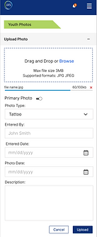
Youth photo page


Design System/
Style guide

What I Learned And Next Step
This is my first time working on a state project. My collaboration, research, documentation, and presentation skills have improved significantly. I have built the design structure, style, and guidelines for the entire system. Oregon State has chosen to build this app using a Low Code Application Platform (LCAP). Once the design and style have been established, most of the pages will be built directly by the platform, as they primarily consist of data entry forms and have a relatively straightforward user flow. From now on, If my contract continues, I'm going to spend more time working with the junior designer to create features and review page designs built by engineer team.
Thank you for reviewing my work. During the portfolio review, I'd like to share a more detailed design process.
Heuristic Evaluation and Navigation Benchmark Study
Initially, the government agencies didn't understand why I needed to conduct the heuristic evaluation and navigation benchmark study. I walked them through my report to demonstrate the areas needing improvement and the rationale behind the new design direction.


